A new Logo for the Tech Workers Coalition
Yeah, that’s right. Tech Workers Coalition is undergoing a restyling and the new logo is just the first step. If you participate in our international Slack server, you probably already know that TWC Global has been working on a new logo. Maybe you even participated in the co-design activities. TWC Global, as the international digital chapter that takes care, among many other things, of the digital infrastructure and the social media communication started a few months ago a work group in charge of updating our visual identity, building on top of the input from the organizers and the broader community. The first result is in front of you.
Mia Casesa, an active member of TWC Global, is the designer that did the heavy-lifting of organizing the co-design activities and ultimately worked on the production of the logo. Let’s hear, directly from her, a comment about the new logo:
For the new logo, I wanted to capture a sense of movement, connectivity and technology all rolled into a unifying emblem that could also pay homage to the history and legacy of labor. The many differing roles and groups an organization like TWC represents were a challenge to bring together initially, but also represented an opportunity to capture that evolving dynamic into a visual medium, and distill the essence of those concepts into a cohesive brand identity.
This result was achieved, among other activities, through the collection of input from our community in the form of five adjectives that represent TWC. We clustered them and then produced a single statement that informed what we wanted to get from this new visual identity.
Here’s the statement: “TWC is an international group of Tech Workers who are building class consciousness and political awareness among Tech Workers to challenge the harms of the Tech industry by building a movement rooted in community and solidarity.”
We believe the new logo was a necessary step for the growth of TWC. It better conveys our relationship to labor, while at the same time conveying clearly that we operate in the space of digital technology. It also serves a more practical function: the old logo couldn’t really incorporate the name of local chapters, while the new one is much more adaptable.
We would like to take the chance of this update to look back at the proliferation of TWC logos that emerged in our first 10+ years of activity.
Let’s start with the current logo. Introduced in 2016, it represented TWC around the world until today, either in its Black/Red, Green/Blue or Black version.
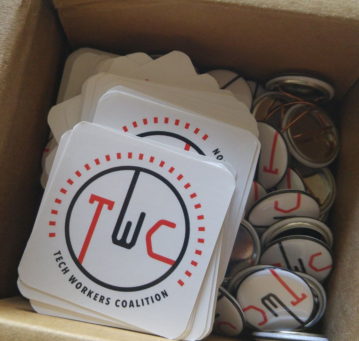
Before that, our website sported a yellow on green logotype, which probably not many of you will remember.
The current logo also gave birth to several local adaptations that enriched the basic idea with slogans and chapter names.

The Italian chapter, born in 2020, went its own way, producing a completely separate logo for its national and city-level chapters.
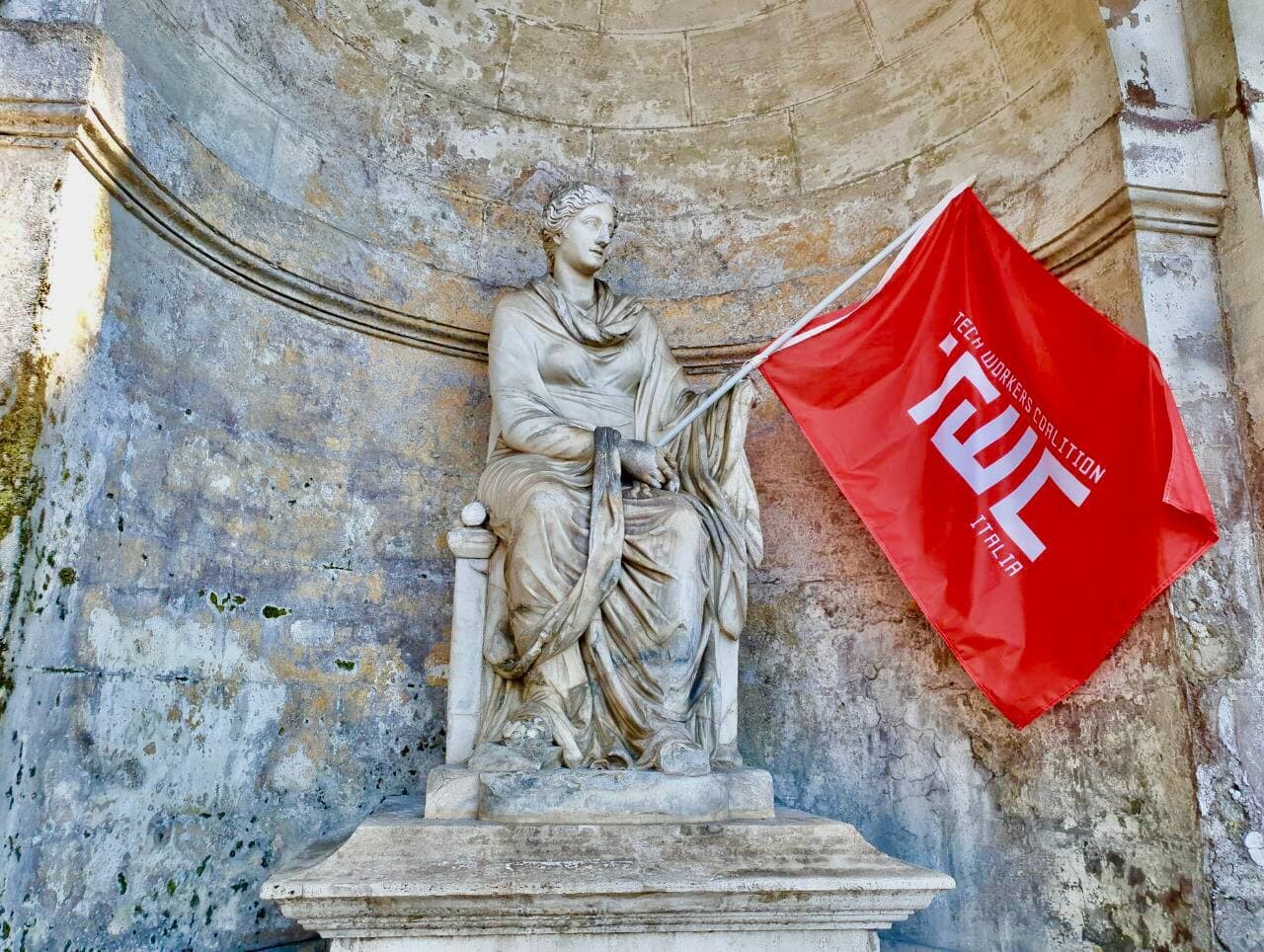
A year later, they also embraced the “tech-monkey” symbol, formally not a TWC-related symbol but a broader tech workers symbol that the Italian chapter occasionally used on flyers and flags.

We conclude this tour with some logos that we could call “non-standard”.
TWC Rome alt logo, with the Lupa, the Coliseum, and the rice supplì and the purple/yellow colors of the Immortal City.
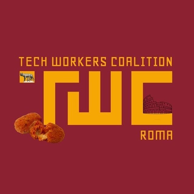
TWC Austin logo, a city apparently living in a permanent Halloween season.

Here a… TWC/Extinction Rebellion cross-over?
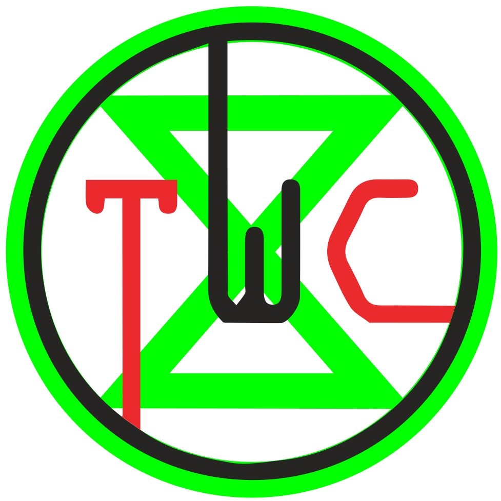
If you’re interested in joining TWC’s community, join our Slack through this form. If you want to start organizing your workplace or join a local or global chapter, consider to fill our on-boarding questionnaire.